AUGUST 2022
Build 26B.00.00
MAJOR TEMPLATE
INTERFACE REDESIGN
I'm extremely pleased with the work we've done with this 25B.00.00 update. While it has taken nearly twice as long as scheduled to get this to its present point, the important stuff is done and working, in my opinion, better, and easier (for CHT developers) than I even dared to hope.
We'll get to that important stuff in a minute, but we'd like to let you know that a lot of work has also been performed on CHT template interfaces. They have been re-designed extensively and with much thought and considerable effort.
About Clarion Template
Interface Design Work
Template interface work is time consuming and exhausting, because although, you may not know it, Clarion Template code does not provide the template developer with a screen designer/previewer.
Template screen layouts are not created by screen preview the way that Clarion developers are able to do screen design and layout in the Clarion IDE window designer.
Clarion template screen layouts are done the hard way: in code. There's no easy way of knowing, except perhaps by instinct and practice, whether the screen co-ordinates of an input field that we present to you in order to enter, say, a file name, on the template interface, is going to come out exactly as we want it to.
Why is that? -- no screen designer or previewer. We have to save template code from, the Clarion Editor and allow it to re-register. Template re-registration is the Clarion template equivalent of application re-compile.
Then to examine the result of our work, the template has to be RUN just to see what its going to look like in the IDE.
That's exactly like writing standard Clarion Code for a window layout, but doing it only with the Clarion Editor and without benefit of a screen designer/previewer.
Then, having to compile the app, and RUN it to see what the window looks like and THEN, perhaps, only after multiple steps, to find that a certain control is too far left and overlays another one.
When we design a template input screen, a lot of the work is intuitive, based on years of practice. After all, we have been producing Clarion templates for 26+ years now!
Compare our template interfaces to those provided, by say, Topspeed itself, and you will appreciate, the great deal of thought, effort and patience that have gone into our template input dialog designs.
CHT Template screen re-design is, at this point, 2/3 complete, with the major templates -- the ones we consider most important -- completed. Now that doesn't mean, that the templates for which we have not yet re-designed the input dialogs are broken, not in the least. They will continue to work correctly as expected. But we're sure you will recognize and appreciate the difference in the new layouts and the improved template documentation.
Browse Styling Control
Like Never Before
We've added a considerable amount of ease, speed and flexibility to our CHT browse extension templates: ExplorerBrowse, HandyMarkerBrowse, ListBoxBrowseExtender and ClientServerBrowseListBox.
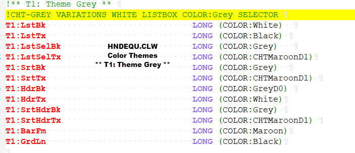
You can now add any one of NINE pre-configured browse color themes with a single click of a button. To see the color scheme layouts in code, open HNDEQU.CLW and search for, say, "T0:" or "T1:"
Browse Color Themes
And Variations
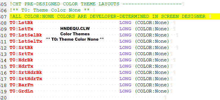
The default setting for application browses encountering these new "COLOR THEMES" browse template enhancements for the first time, is the one we call "T0: Theme Color None".
This setting automatically disengages CHT Color themes from your browse and passes through your own window and listbox colors as you may have them configured in the IDE window designer.
Of course, browse behaviour works as always under "T0: Theme Color None": column-click sort, filtering, locating, scroll and highlight behaviour, all of it. Only our color and highlight styling pre-choices are disengaged and the choices you made in your window design, show through.
Examples of Code Generated
By One of Our Demo Apps
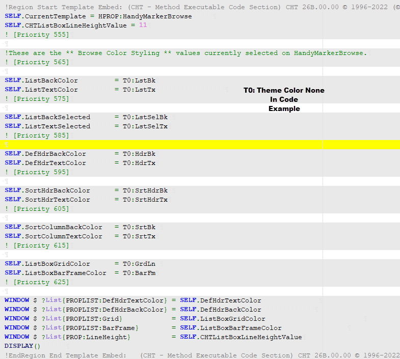
These are the ** Browse Color Styling ** values currently selected on HandyMarkerBrowse. The browse color theme, by default, is set to "T0: Theme Color None" as described above.
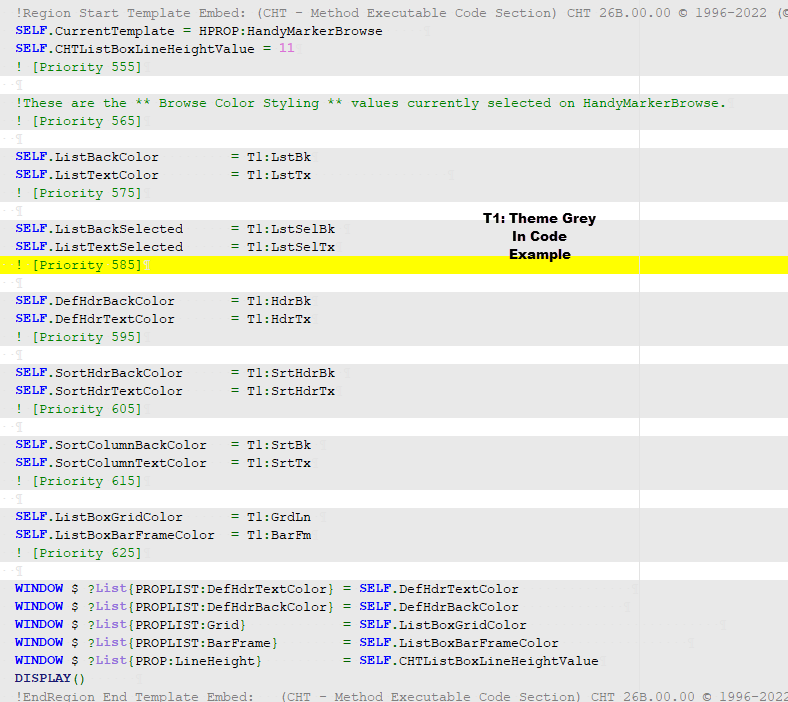
To engage any of our nine, instant, pre-configured color and highlight themes listed above under "BROWSE COLOR THEMES AND VARIATIONS" simply visit the CHT browse template in use on your procedure, open the "** Browse Color Styling **" dialog, (see below) and select a color THEME by pushing a single button.
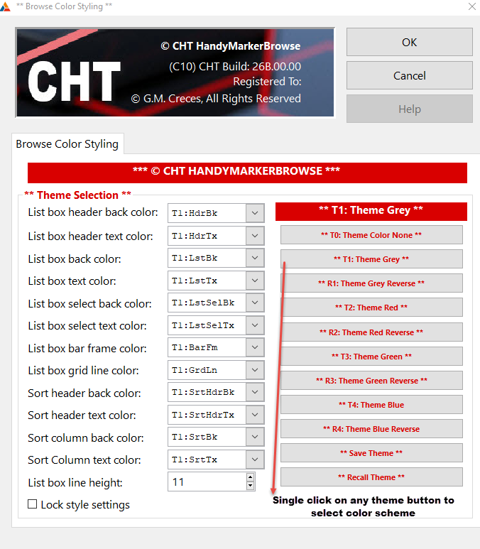
All theme colors are tastefully pre-selected to provide maximum visibility of text through background even if you choose to intermix the pre-configured choices, which you can easily do.
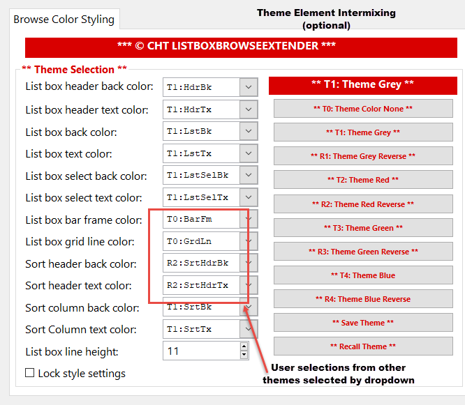
Though you certainly do not need to manually intermix. But color-theme settings CAN be manually intermixed on the template for different browse elements such as sort header highlight color, browse header color, browse grid and selection bar color, for a totally user-custom effect that still maximizes text readability through color.
If you choose to intermix instead of simply selecting one of our pre-sets, your choices can be saved to our template config file and read, again with one click, into other procedures and/or other apps, for a totally fast, easy and consistent look and feel from procedure-to-procedure and from application-to-application.
Application Styling:
ApplicationImagesex
Global, Local or Skip
Application styling may be configured from ApplicationImagesEx to apply globally to your application. The global template ApplicationImagesEx, attaches our ProcedureImagesEx template to your procedure window, where it applies color, font and optional wallpaper values to your procedures under the following conditions determined on ApplicationImagesEx.
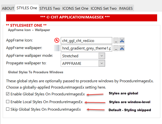
"Enable Global Styles on ProcedureImagesEx" is the setting we primarily use, and which we prefer for ourselves, since once the style settings for any application are decided, these settings can be saved to "Template Config" and read into all other applications with a single button click.
Global styling cross-configuration of this sort promotes good, consistent design implementation. It provides interface consistency from one procedure to another and from one application to another.
"Enable Local Styles on ProcedureImagesEx", the second global ApplicationImagesEx option, provides ON-TEMPLATE procedure window styling control at a procedure-level.
Style settings are passed through from global to ProcedureImagesEx, where they can be changed and overridden locally right there on ProcedureImagesEx, giving you procedure-level styling via this local template.
Finally "Skip Global Styles On ProcedureImagesEx" mode is provided on ApplicationImagesEx. This turns off CHT styling and reverts it to 100% developer control at the window designer level. In this case ProcedureImagesEx still attaches to your local window, but the template is disengaged, from generating any styling code into the window procedure. You can, of course, embed styling changes if you want to, but ProcedureImagesEx does not generate styling code.
Procedure Styling:
ProcedureImagesEx
Regardless of your Global styling choices on ApplicationImagesEx, CHT's ProcedureImagesEx template still provides local, savable, (window procedure control) over style settings by offering these four options which are always available to the developer regardless of any global ApplicationImagesEx settings. However, the choice made on ApplicationImagesEx is selected and acted upon locally, unless changed (i.e. overridden) locally on ProcedureImagesEx.
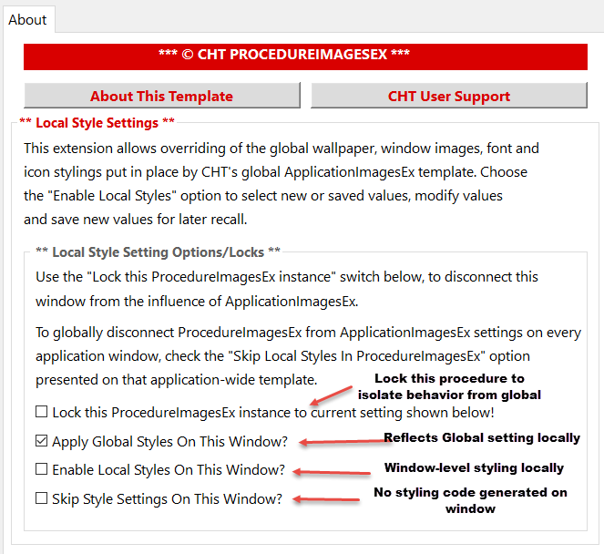
The first choice, above, provides a way to locally remove the ProcedureImagesEx template from the influence of ApplicationImagesEx and "Locks" the template to one of the settings selected there, namely 2, 3 or 4 as determined by the developer.
With "Lock" disengaged (unlocked is default) the setting you chose on ApplicationImageEx is passed through to our procedure-level, local template. Hence, ProcedureImagesEx provides the styling services selected on the global template.
Setting #3, "Enable local styles on this window" provides three extra styling tabs at the local level to ProcedureImagesEx. These are: "Local Images" "Local Window" and "Local Controls". These styling tabs can be completed, manually or developers can insert CHT defaults and/or save developer choices and recall developer choices made elsewhere.
Setting #4 "Skip style settings on this window" causes ProcedureImagesEx to generate NO styling-related code into your window procedure. The template does however generate descriptive comments to explain what the ProcedureImagesEx settings are, and what the results of developer choices will be in this specific window procedure.
Please take some time you study CHT demo applications for example usages of the the features described above. Good example apps are:
HNDCMP.APP (HNDMARKERBROWSE)(i.e. HMB)
HNDSQLPOPFAVEXPB.APP (EXPLORERBROWSE) (i.e. EXPB)
HNDCLIENTCL.APP (CLIENTSERVERBROWSELISTBOX)(i.e. CSBL)
HNDTPLREGISTRY.APP (LISTBOXBROWSEEXTENDER) (i.e. LBX)
There are over 100 other CHT example applications to illustrate CHT template usage.
If you'd like to implement a color-intermixed browse in your application(s) just navigate to our browse template (LBX) in our HNDTPLREGISTY.APP example, and open the "Browse Color Styling" dialog and click the "SAVE" button. Now in your own app, regardless of which of our browse templates you've applied, Click the "RECALL" button and the styling-design from HNDTPLREGISTRY.APP is now applied in your own application.
Contact CHT